New image of EL5-Energo
PJSC "EL5-Energo" officially presented its new logo. This is the first step towards the evolution of the company’s image and its corporate identity. But first things first, let's start with the EL5-Energo logo itself.
The creation of a new visual image is a logical continuation of corporate changes in the company and, most importantly, the change of its name.
EL5-Energo is a reliable Russian supplier of electricity and heat, an investor in renewable energy, and a leader in sustainable development in the Russian market. This is a company with a historical past, a fullfilling present and a confident future.
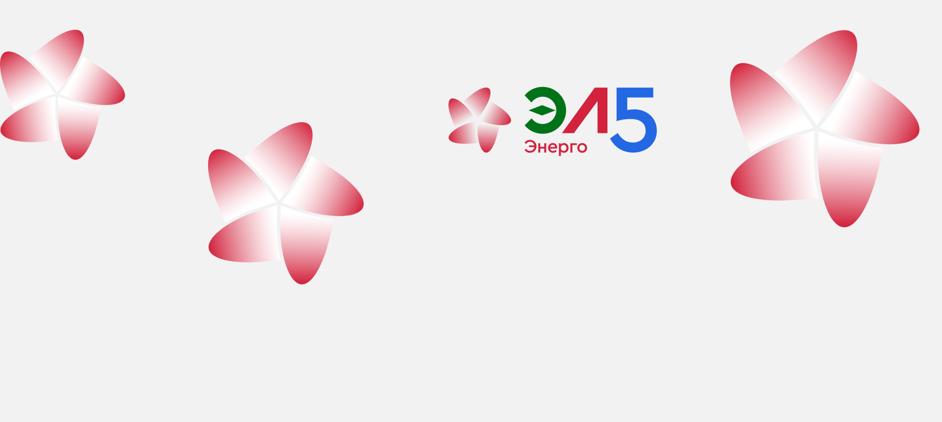
Each sign in the company’s name is symbolic.
For example, the letter “E” symbolizes the electricity industry and contains a compass needle element that demonstrates our desire to be a benchmark in the electric energy sector. The green color reflects the development of renewable energy sources.
The letter "L" reflects the company’s belonging to the new majority shareholder PJSC "LUKOIL".
The number 5 denotes the continuity of traditions and experience and refers to the historical name of the company OGC-5. Its execution in a blue tint symbolizes the company's gas-fired power plants.
The dynamic element, executed in a gradient to create the effect of constant movement, resembles both the rotation of a turbine and the spinning blades of a wind turbine, and also visualizes a flower image, referring to the environmental friendliness of the company's projects.
Soon the EL5-Energo logo will appear on all branded carriers of the company, including production facilities and offices of the company, our official website and pages on social networks.
A new stage in the development of the company begins, the foundation of its mission and values is laid. Follow our news, we promise that it will be fascinating.